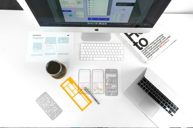
When you land on a website the first thing that grabs your attention is often the typography. The right font choices can set the mood guide your eyes and make your experience memorable. In today’s fast-paced digital world web designers are pushing creative boundaries to make text not just readable but truly captivating.
Staying ahead in web design means keeping up with the latest typography trends. Whether you’re revamping your portfolio or launching a new business site you’ll want to know what’s shaping the look and feel of modern web pages. Get ready to discover the trends that’ll help your site stand out and keep visitors coming back.
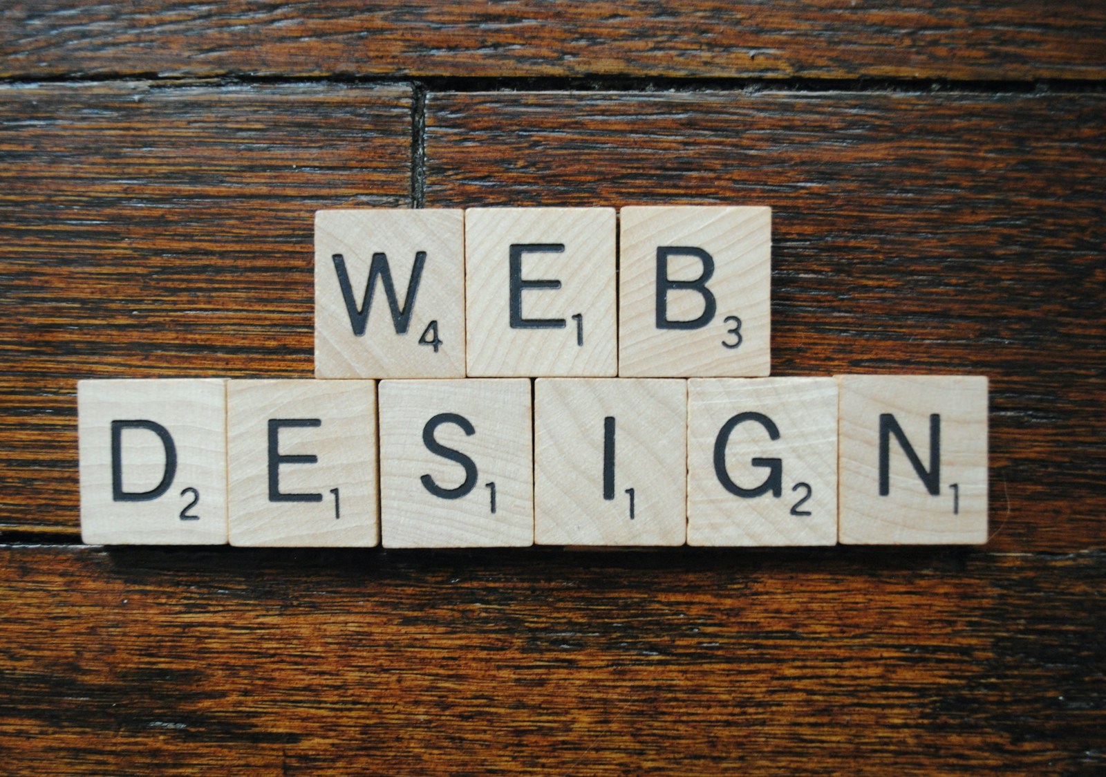
The Importance of Typography in Modern Web Design
Typography shapes the visual hierarchy and readability of your digital content. Fonts, sizes and spacing influence how users navigate pages and absorb information. Clear, distinct typography creates smoother interactions and faster comprehension.
Readable typefaces improve accessibility for visitors using various devices or assistive tools. Consistent styles help build brand trust and keep your visual identity recognizable across platforms. Subtle differences in font weights and line heights define content sections, guide user focus and support intuitive site structure.
Designers select contemporary fonts to give your site a fresh, relevant look that aligns with user expectations. Strategic typography choices ensure information stands out, increasing user retention and engagement. When you implement effective typography, you create compelling digital experiences that keep visitors returning.
Minimalism and Clean Fonts
Minimalism in typography creates an immediate sense of clarity on your website. Clean fonts like Helvetica, Arial, and Futura offer simple, geometric shapes that eliminate distractions while maximizing readability. Sans-serif options, including these examples, dominate modern interfaces because they signal professionalism and streamline navigation for users across devices.
Choosing minimalist typefaces emphasizes legibility at every screen size. Designers favor these fonts for their ability to support visual hierarchy, helping your users identify key sections—such as navigation bars and calls to action—without visual clutter. Simple fonts with little decoration ensure that your content appears both elegant and approachable.
Consistent use of clean, simple typography reinforces your brand’s identity. Clean fonts ensure every headline and paragraph maintains the same refined tone, creating trust and recognition. This approach, backed by design leaders, anchors your visual identity while adapting seamlessly to contemporary web layouts.
Creative Use of Bold and Large Type
Bold and large typography shapes modern web design by seizing user attention and establishing a memorable first impression. Oversized letterforms, as seen in landing page headlines for tech startups and portfolio websites, dominate visual space and immediately direct focus to core brand statements. Chunky display fonts like Roquen, Choco Bold, and Sirens deliver a strong identity, differentiating your brand in crowded digital markets.
Rounded and humanist sans-serif fonts—examples include JUST Sans and Visby—infuse warmth and approachability into bold compositions, making messages feel more expressive and personable. Hand-drawn or playful fonts further enhance this effect for brands targeting creative or youthful audiences.
Combining bold headlines with ample white space and subtle subheadings prevents designs from feeling heavy or overwhelming. Strategic spacing maintains readability and gives your message room to breathe, ensuring users absorb information without distraction.
Maximalist typography, characterized by multi-layered, oversized text and high-contrast font pairings, transforms text into a core visual storytelling element. Layering serif and sans-serif fonts—like Broken with JUST Sans—adds depth and richness to each section, increasing engagement and visual interest.
Variable fonts empower you to dynamically adjust boldness and scale, supporting responsive design and optimizing load times. This flexibility enhances user experience across every device, allowing bold typography to adapt fluidly whether users access your page from desktops or smartphones.
Variable Fonts and Flexibility
Variable fonts bring unmatched flexibility to your modern web design projects by including weight, width, and slant options in a single file. You can dynamically fine-tune your typography for both desktop and mobile displays, for example by adjusting font thickness for headlines or modifying text width on the fly for navigation menus. This fluid, multi-axis control helps your type respond instantly to screen size changes or interactive elements like scrolling.
You’ll see performance gains from variable fonts since one file can replace as many as six or more separate traditional font files. This cuts page load times and reduces data use—an essential factor for mobile-first websites and sites targeting global audiences with inconsistent connection speeds. Leading research from Google Fonts and industry reports cite measurable drops in total font data transfers, increasing site speed by as much as 20% when switching to variable fonts.
Expressiveness also increases as variable fonts open up creative options, letting you experiment with playful transitions or bold, animated typography. For instance, you can create smooth text animations where letterforms stretch or contract as users interact with your content, supporting trends like maximalist typography and unique brand storytelling.
Adopting variable fonts also promotes visual consistency since you can use the same core font with subtle variations instead of mixing multiple unrelated files, helping you maintain a coherent brand identity while meeting the design needs of each device or usage context. This adaptability brings both technical efficiency and creative control to your web design, keeping your typography modern, fast, and visually engaging.
Animated Typography Effects
Animated typography effects bring movement and interactivity to digital text, blending kinetic animations with user behaviors like scrolling and touch. You see kinetic typography transform headlines, navigation labels, and calls to action as users swipe, click, or change device orientation. Animations adapt in real time using CSS media queries, Sass, and Less preprocessors. Designers leverage AI-driven rendering to ensure text animates smoothly no matter the device or platform.
SVG integration keeps animated fonts crisp at any resolution, supporting the needs of retina screens and responsive layouts. Fast animation loads even over 5G connections, letting users interact with dynamic text without lag or quality loss. Performance and accessibility work in tandem. You can toggle motion reductions, enable contrast adjustments, and rely on screen readers, making animated typography inclusive for all visitors.
Variable fonts power many of these effects. You get fluid weight changes and real-time width transformations embedded in a single font file, keeping performance high and transitions seamless. Designers combine animated text with bold maximalist typography, layering and scaling letters for dramatic storytelling and branding.
Playful and experimental techniques rise in popularity. You spot liquid text effects where letters ripple or “melt,” instantly delivering a modern, trendy vibe. Retro and hand-drawn animations inject personality into headers and logos, reinforcing uniqueness and brand memorability. Animated typography in 2025 evolves static type into a digital experience—interactive, accessible, and visually distinct.
Custom and Handwritten Typefaces
Custom and handwritten typefaces strengthen your website’s distinctiveness and emotional resonance. Custom fonts, created specifically for your brand, offer exclusive character traits that generic typefaces can’t match—for example, bespoke sans-serif wordmarks used by leading technology companies or custom serif typeface signatures in luxury retail. These unique letterforms reinforce your visual identity and keep your brand recognizable even in highly competitive digital spaces.
Handwritten or organic typefaces inject authenticity and warmth into modern web interfaces. These typefaces, modeled after real handwriting, make digital content approachable and relatable. Brands in lifestyle, wellness, and creative sectors often leverage hand-drawn scripts—for example, playful brush calligraphy or quirky marker-style fonts—to foster emotional connections and express individuality. Designers increasingly use this style in 2025 web design to bridge the digital-human gap and drive engagement.
You reveal your brand’s story more effectively when combining custom and handwritten fonts with established design elements. Use these typefaces in hero headlines, call-to-action banners, and logo highlights to amplify visual hierarchy and evoke emotion. As consumer expectations shift toward personalized experiences, embedding bespoke and handwritten typography can boost your website’s memorability and differentiation.
Accessibility and Readability Trends
Legible fonts dominate accessible web typography, as you make every letter distinguishable for all users. Wide letter spacing, seen in examples like Verdana or Helvetica, increases character clarity and reduces reading fatigue. Ultra-light font weights often create visibility issues, so you benefit from medium or bold weights in body copy, especially on lower-resolution screens.
Optimized readability lets you deliver information quickly. Font sizes above 16px for body text, line lengths between 50–75 characters, and comfortable line heights at 120–145% support fluent scanning. Creating high color contrast between text and background, such as black on white or dark gray on light, improves information access for low-vision users. Lowercase body text, not all caps, preserves shape recognition and boosts reading speed, according to recommendations from sources like Webflow and TheeDigital.
Variable fonts streamline responsive accessibility. These single-file fonts combine multiple weights and styles to adjust seamlessly to user devices, maintain consistent branding, and minimize load times. Switch styles automatically for mobile or desktop without sacrificing clarity or performance. Examples include Open Sans Variable and Inter Variable.
Applying these accessibility and readability techniques strengthens user interactions, supports diverse needs, and aligns your site with leading web standards for inclusivity.
Color and Contrast Innovations in Typography
Color and contrast innovations in typography drive engagement and expressiveness across 2025 web designs. Colorful and gradient typography uses vibrant colors and gradients on headings and CTAs, making text visually dynamic. Gradients blend multiple colors into text, creating energetic and contemporary visuals while sustaining readability against simple backgrounds.
Warm, soothing color palettes shape a user-friendly web environment. Rich warm tones and multi-tonal schemes, instead of oversaturated hues, reduce eye strain and create inviting digital experiences. This trend guides users smoothly through site content and enhances comfort during prolonged browsing.
High-contrast font pairings introduce both style and clarity. Combining serif and sans-serif fonts with bold contrasts, for example pairing classic Garamond with clean Roboto, strengthens hierarchy, supports accessibility, and reinforces brand personality. These strategies ensure effective storytelling, distinguish sections, and make sites memorable.
Maximalist typography maximizes contrast through oversized, layered type and bold colors. Large display fonts in vivid tones, as used on trend-forward agency homepages, create visual drama that differentiates brands while keeping key text readable.
Organic, authentic typography leverages handwritten and imperfect fonts to evoke warmth and humanity. These fonts employ color and contrast to highlight uniqueness, with uneven lines or brush-style glyphs in earthy tones driving creative appeal for lifestyle or artisan brands.
Variable fonts support dynamic styling and optimize load performance. These fonts adjust color and contrast responsively, enhancing text on different screens and improving user experience across desktop, tablet, and mobile.
For best results, prioritize readability by ensuring strong contrast between text and background. Limit font combinations to maintain clarity, and use performance-optimized font files, enabling accessible, high-speed browsing. Color and contrast innovations in typography blend form, function, and emotion, advancing the impact of modern web design.
Conclusion
Staying ahead in web design means embracing the latest typography trends and using them to shape memorable digital experiences. The right type choices go beyond aesthetics—they drive engagement, support accessibility, and help your brand stand out.
As you refine your website’s look and feel, keep exploring new font technologies and creative approaches. Your attention to typography will ensure every visitor enjoys a seamless and visually compelling journey.