Choosing the right fonts can make or break your website’s first impression. Clean templates are all about clarity and simplicity but the secret ingredient is how you pair your fonts. The perfect combination instantly boosts readability and gives your site a polished modern feel.
You don’t have to be a design expert to get it right. With a few must-have font pairings up your sleeve you’ll create layouts that look professional and inviting. Ready to find out which combinations will elevate your clean website template and keep visitors coming back? Let’s dive in.
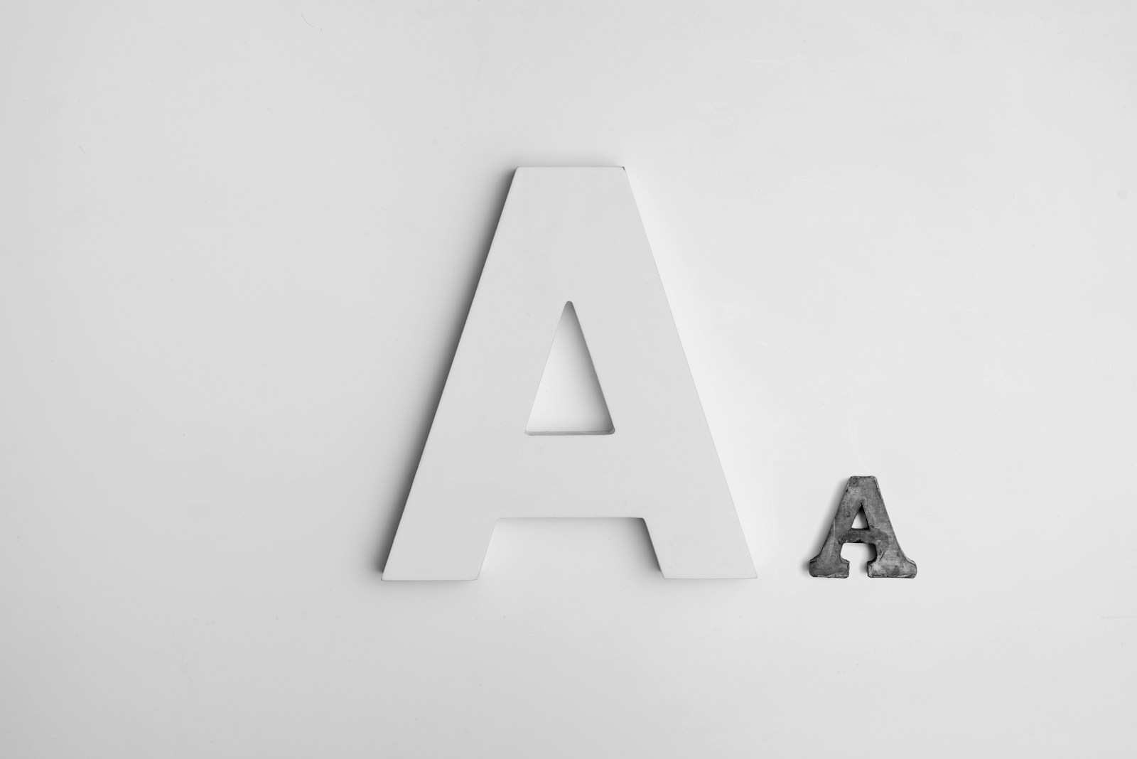
Why Font Pairings Matter in Clean Website Design
Font pairings create visual harmony throughout website templates that prioritize a clean design. Typefaces guide visitors’ eyes, so pairing fonts with clear contrast improves navigation speed and comprehension. Clean templates rely on simplicity, so combining too-similar or clashing fonts distracts the viewer instead of supporting usability.
Consistent font combinations boost scannability and help structure content blocks such as headers, subheadings, and body text. Effective pairings, like sans-serif headers with serif body copy, let you direct attention naturally and keep the layout uncluttered. Google’s UX research confirms that font choice directly affects readability and retention rates, especially on minimalist sites.
Accessible font pairings also support site inclusivity. Web Content Accessibility Guidelines (WCAG) recommend high readability, which strong font combinations enable by maintaining adequate contrast and character distinction. In this way, thoughtful typefaces contribute not only to aesthetics but also to the overall user experience.
Key Principles for Choosing Font Pairings
You create professional, clean website templates by following precise font pairing principles. Strategic pairings support both visual harmony and seamless navigation.
Balance and Contrast
You enhance visual hierarchy when you pair fonts that offer strong contrast in weight, style, or size. For example, a serif heading matched with a sans-serif body text—like Montserrat for headlines and Merriweather for content—gives sections clear distinction and attractive variety. Contrasting thick titles with lighter paragraph fonts, as in the Josefin Sans and Cardo combination, adds dynamism and structure without cluttering layouts.
Readability and Accessibility
You increase legibility by choosing fonts with clear shapes, generous x-height, and proper letter or line spacing. Fonts like Muli for body text maintain simplicity and allow for faster reading, especially when paired with a bold, easily readable heading font. Consistent color contrast and ample line height between text and background, both key for accessibility, ensure your website content remains readable across devices and inclusive for users with different visual abilities.
Top Must-Have Font Pairings for Clean Website Templates
Pairing fonts that offer clear contrast and harmony strengthens your website template’s design. Strategic combinations not only support readability but create a distinct, professional feel that elevates your content.
Sans Serif and Serif Combinations
Pairing a sans serif with a serif font delivers reliable contrast and structure. For example, use Roboto (sans serif) for your headings paired with Lora (serif) for body text. This blend creates a modern, minimal feel while maintaining classic elegance, especially on content-heavy sites. Font combinations following this pattern clarify sections and streamline navigation, helping users scan information efficiently. Strong contrast in style between heading and body enhances hierarchy and overall organization.
Modern Sans Serif Duos
Combining two modern sans serif fonts introduces a cohesive, uncluttered look. For instance, Futura PT + Arial gives your site geometric sharpness with familiar readability. Another pairing, Roboto Condensed + Cabin, provides clean lines and open forms that reinforce minimalist aesthetics and easy reading. Such duos keep content approachable and versatile, supporting a professional impression without visual distraction, especially for portfolios or business sites.
Minimalist Serif Pairings
Mixing serif fonts in varied weights or styles brings subtle sophistication to minimalist templates. Pair Josefin Sans (which includes serif-inspired elements) with Cardo (classic serif) to achieve a refined, romantic look suited for elegant branding or creative projects. Serif-only pairings deliver timeless character while keeping layouts airy with light weights and ample spacing, maintaining both style and clarity for text-heavy or branding-focused websites.
Tips for Implementing Font Pairings in Your Template
Font pairings work best for clean website templates when you apply consistent design methods. Strategic use of fonts creates visual structure, enhances navigation, and improves readability for every visitor.
Consistency Across Elements
Consistency across elements helps your website template look professional and uncluttered. Use one font for headings and another for body text; for example, pair Quattrocento Sans for headlines with Muli for paragraphs. Apply the same fonts throughout all pages, including navigation links, callout boxes, and captions. Emphasize text using bold or italics within a single font family instead of switching fonts mid-sentence. Unified font use supports user trust and strengthens your brand identity.
Hierarchy and Emphasis
Hierarchy and emphasis clarify which information matters most. Pick the most distinctive font for headlines, such as Abril Fatface, then pair it with a clean sans-serif like Lato for supporting text. Establish headings, subheadings, and body content using clear size, weight, and style differences—headings often at 2.0x size, subheadings at 1.5x. Use heavier or bolder weights for titles and lighter weights for paragraphs. Create visual pathways with font combinations that naturally separate sections and highlight key content points, guiding users intuitively through your site.
Conclusion
Choosing the right font pairings can transform your clean website template from ordinary to outstanding. With just a bit of experimentation and attention to detail you can achieve a polished look that’s both modern and user-friendly.
Remember your font choices set the tone for your brand and shape how visitors interact with your content. Take the time to test combinations and always prioritize readability and accessibility. Your website’s first impression depends on it.